20120228

Slick PDFs from scanned documents

It is convenient to have digital versions of your most important documents. While they will probably not hold up as a replacement should the originals disappear, the ability to produce a copy at any time with a simple print command alone is huge. Also, to be able to attach a "physical" document to an email or a job application is really handy and professional.
Let's have a look at how to generate PDFs from scanned documents, which are:
  • small in file size
  • one file per (potentially multi-page) document
  • fit to generate a good copy of the original
First, start with a high quality scan of the document. Make sure the page is positioned correctly to avoid skew and shading. A resolution of 300dpi is enough in my experience. If the document consists solely of text, use linedrawing mode to reduce the file size. This will save you some work later.
On linux, this command will do that work for you:
scanimage --mode=Lineart --resolution=300 --format=tiff > in.tiff
Second, improve the resulting image. I recommend to crop the image to the page and to adjust the levels to generate a clear white background and crisp black text. If you are using the GIMP for this, choose Color->Levels and use the black and white point tools.
The same number of colors creates a much clearer picture
if the input image contained fewer colors.
Also, consider reducing the colors in parts of the image. Many times documents contain just a small part in any color (like a signature). Reducing the colors of the rest of the document allows the compression to achieve good results with a smaller number of total colors.Choose black and white only for text! Don't worry about aliasing, the resolution will take care of that.
The secret to achieving small file sizes is to reduce the number of colors required to save the image. Change the color mode to indexed (Image->Mode->Indexed... in GIMP) and have it generate a palette with a small number of colors. 16 entries per color should be plenty. Leave out black and white in that calculation if you reduced them to one gray value each. So, for text only documents you should arrive at 1 color, for text with a single additional color 16 is more than enough.
Save the result as a TIFF file (use "save as..." to guarantee you get to choose the compression parameters) and instruct it to use lzw compression. (Note that this file format does not support transparency, so remove the alpha channel from each layer first by right-clicking and choosing "Remove Alpha Channel".)
The resulting image should be far smaller in size than the original. Less than 200KB is realistic for black and white, not much more than 1MB for anything with more colors is feasible.
Next, if your document consists of more than one page, repeat the steps above for each. Then join them together using the command tiffcp:
tiffcp -c lzw page1.tiff page2.tiff ... out.tiff
Of course, replace the pageX.tiff with the filenames you actually chose.
Finally, to turn this TIFF file into a PDF, use tiff2pdf. This should work:
tiff2pdf -z -pa4 -F out.tiff -o out.pdf
You can also specify the author information (your name, presumably) using the -a parameter and the title using -t. So maybe:
tiff2pdf -z -pa4 -F out.tiff -o out.pdf -a "John Doe" -t "Master's Certificate"
And that should be it!
Did I miss anything? Do you have more tricks up your sleeve for how to make a really high quality digital version of your documents? Share them in the comments!

20090513

Okular - KDE4 PDF Viewer (and much more)

One of the exciting new programs introduced in KDE 4.0 is a unified document viewer called Okular.
Based on the solid foundation of KPDF from the KDE3 era, Okular became a document viewer with many more features and support for a large number of formats. At the time I wrote about it in my blog post about KDE4.0.0 it supported 28 file types. In version 0.8.2 (part of KDE 4.2.2) as shipped with Kubuntu Jaunty it supports 45 file types. Note that these numbers may vary greatly with the number of packages supporting various file types installed and that some of the supported types are just compressed versions of others.
Here is what it (a later version: 0.14.1, the screenshots were lost and needed to be re-done) looks like displaying in order: a PDF file, a JPG image, an OpenDocument document and a Comic Book Archive comic.
Additionally Okular supports a presentation mode (not pictured) as well as annotations and reviews:
Okular is slick, powerful and easy to use. It is a great example of the new user interaction ideals seen in all components of KDE 4.

20090409

Location-Based Services on the Android Platform

AndroidIf you are like me you have ever large plans for projects and products, which more often than not are doomed from the outset by a severe lack of time. All this changes of course when the project you are tackling is one which you are being watched and mentored to do. The amount of time at your disposal doesn't change, of course. Instead it is not the project being doomed, it is you if you don't make the time. This post is about a project, which started in a relaxing atmosphere such as this. If you want all the gory details get the paper I am about to introduce to you now.

For the last far too long period of time I have been developing a project for university. The goal of which was to evaluate the new Google Android mobile device platform for its suitability to the development of location-based services.

A location-based service - besides sounding remarkably cool - is made up of a program or set of programs which supply the user with information and actions depending on his or her location. It is a comparatively easy to achieve kind of context-awareness. The idea being that if we supply our assistant devices with information about our current environment they ought to be able to filter the information we might want to access and present us with actions we are more likely to take than they would otherwise be. The research community has high hopes for location-based services. Projecting that it will allow major gains in usability, going so far as to make ideas practical, which have so far never come to fruition.

With a whole new player (Android) with powerful backing (Google) entering the mobile arena the question of whether it might be able to stir things up in the location-based service space was intriguing. So I set out to build a location-based service to evaluate the Android platform.

The project


Specify when and where to show the messageSay you are getting dozens of emails every day. (Reading - as you are - a blog post about an operating system designed to run on a mobile communications device, I'd say this is probably not too far from the truth.) Many of these messages will ask you to do stuff you really cannot be bothered to do right now. A sufficiently advanced and knowledgeable assistant device would be able to filter these messages and present them to you when you are ready to act upon them, when otherwise you'd just become cross. This is obviously an example of a context-aware application. And the information required to fulfill this vision are notoriously hard to come by. So as everybody does, I took a step back and morphed this concept into an application which could work on the subset of context information I might somewhat easily obtain: location and time.

The resulting application is this: A friend of yours sends you a message. She knows she stands a better chance of you getting back to her if you receive the message when you are in the mood and have the opportunity to act upon it. So she annotates the message with a time and place she thinks you might be willing to receive it. Say an invitation for dinner is likely to be interesting to you beginning around 5 in the evening and only if you are at home (ie not working or commuting).
The finished application works. With a little huge problem beyond my control, which I will get to.

Developing on Android


DeveloperAndroid is well suited to the development of mobile applications. This is rather important if you want to develop any kind of meaningful location-based service. A location-based service running on your desktop computer might before long turn out to be rather boring.
Android requires that developers design applications differently from traditional environments. And in my opinion (hey, that's what blogs are for) it was a good decision that it does. Android applications are split into a number of comparatively loosely coupled components, which act in concert to produce the "experience" of the product. Saving of data is one component's responsibility, showing one particular view is another, reacting to changes in the environment is a third. Together these components create an application, which is capable of storing data, interacting with the user and reacting to changes in the environment. (If this sounds interesting to you, you should really read the paper.)

Actions to take for a friendThese applications are just as powerful as more monolithic ones, but they offer the system a lot more power to manage its components. This way the system can guarantee that applications remain as responsive as possible under resource constraints. Which is rather important in a mobile environment.

Follow the Android


Unfortunately, when I started developing the project the current version of Android was a pre-release. For one this meant that I had to port the project a number of times as the API changed. For another there were a number of bugs, which were not documented, requiring me to debug the project without actually turning up any bugs.


But in hindsight worst of all was that the Google decided to remove built-in XMPP capabilities in one of the last pre-releases. At the beginning of the project it looked as though tight XMPP integration would become a major selling point. So the message transfer mechanism I built the whole baby around of is all XMPP. And when Google decided to drop that technology (for dubious reasons) I was left out in the cold. So no using the application on real devices in the foreseeable future. Sucks? Yeah, big time.

Is Android the sliced bread of location-based services?


Android is a good choice for location-based service developmentAs any answer to such a question my results can only be seen as a kind of well-informed opinion. Generally yes. Android provides a number of useful features in the context of location-based services. For one it has built-in location APIs and a maps widget, which is readily available on most devices (by virtue of being a Google-supplied "Optional API"). So if all you are after is a well integrated location system, Android is as good a choice as any. Additionally, being a new platform Android is certainly not any less advanced concerning the technologies which have so far proven to be interesting.
Is that enough to learn a new platform? Frankly, I don't know. Assuming most of the bugs that bothered me so much have been worked out, I think Android should be a pretty nice environment to program in. Designing my project took a few iterations to get right and I think this is probably the largest obstacle facing any newcomer to the Android platform.

The Location-Based Services on the Android Platform paper can be downloaded on my website. My presentations are usually not easy to comprehend without the accompanying talk. And it is in German. But here is the Location-Based Services on Android presentation as well.

I sincerely hope this project is of value to you. If there is any information you'd like me to give you or if you have something for me, please leave a comment.

20090201

Simple atom aggregator in PHP (with source code)

I wrote a small class to fetch and parse atom feeds in PHP. This could be useful to someone, so I release it under the GPL. The result of this little project can be seen on my web site. Prominently featured at the top of the page is a list with my recent blog posts aggregated from various web services.

This was an interesting little project, which lends itself as a nice example for people interested in PHP programming. Note though that PHP is not really my area of expertise, so there are likely ways this could be improved. Leave a comment!

This fun little project consists of two classes: Entry and AtomParser. AtomParser fetches a feed and parses its contents. This is made easy by PHP's XML Parser facilities. The information likely to be interesting to people wanting to show the contents of a blog on a different website (most importantly title and text of the post) are stored in Entry objects.

For convenience AtomParser supports adding multiple sources and sorting them by date. Retrival of the entries is realized in a for-loop friendly getEntryIterator(), hasNextEntry(), getNextEntry() way.

Combined this allows the following snippet to work:

$parser = new AtomParser();
$parser->addSource("http://identi.ca/api/statuses/user_timeline/mauder.atom", true /*microblog*/);
$parser->addSource("http://drowstar.blogspot.com/feeds/posts/default", false);
$parser->sortByDate();

for($iterator = $parser->getEntryIterator();
$parser->hasNextEntry();
) {
$entry = $parser->getNextEntry();
printf("<h1>%s (%s)</h1>\n%s\n", $entry->title, date("Y-m-d", $entry->date), $entry->text);
}


The snippet I actually use on mauder.name is rather more complicated, but as the presentation is very much a matter of taste I leave it to the reader to find one he is happy with.

I release this snippet under the GPL. Email me if you need a different license.

20080214

Integrating GTK apps with the KDE4 desktop with gtk-qt for Qt4 (screenshots)

For KDE3 David Sansome wrote a special GTK theme gtk-qt, which instead of drawing its own representation of buttons and other user interface elements, called the corresponding Qt3 drawing functions. Believe me, this sounds a lot more trivial than it is.

When it was done, it showed some very impressive results.
gtk-qt for KDE3Image courtesy of David Sansome


However, after KDE4 was released (my review), Qt3 started to look equally out of place as gtk rather quickly, when the Oxygen widget style manifested itself as the default KDE4 look:


When Firefox 3 beta 3 was released the other day I tried to get a glimpse of the new gtk widget integration. Suffice it to say: It looked really strange and not like something they would have bragged about.


It's obviously KDE3 showing here. So I decided to see if there was a KDE4 version of gtk-qt. It turns out there isn't. But I found this bug report and a reply by David Sansome himself, stating that:
Just wanted to let you know that I *am* working on this, but as previous posters have said Qt4 has changed a lot in the theming department and it's not as simple as just porting the old code over.

He has created a branch in the development repository, which I have checked out. Screnshots incoming!

Keep in mind: THIS IS NOT A RELEASE! But very much a work in progress. If there are problems, they will be ironed out!

The first impression is that it looks very impressive!


The not quite so straight-forward firefox interface reveals some drawing issue though:

But they are IMHO a lot better to look at than the qt3 version, which just looks thoroughly out of place:


There are also issues with widgets embedded into web pages, which disappear on a re-draw (for example scrolling page-wise, not progressively).

Compare with the same piece rendered by Konqueror:


Overall the port seems to be progressing well (the repository is seeing frequent commits) and I look forward to GTK apps integrating more smoothly with the KDE4 desktop.

Update: I have made a mistake attributing the brokenness we saw with the current firefox beta to gtkqt. Instead it appears the feature was not working quite correctly in firefox itself. I noticed a couple of days after this post was published that the same drawing weirdness we saw in the screenshot also appears on a pure gnome system. I can't reproduce it now and as matter of fact the current ubuntu packages on hardy make firefox fit in nicely.
Sorry about this mis-information. It seems gtkqt4 is in even better shape than I originally thought.

20080213

The new Google Android interface

Google released a new version of the SDK of its Android mobile platform today. News that this release would introduce a new interface has been going around and in fact the new interface has appeared.

Being a sucker for this kind of thing (and having some work for university to put off...), I installed the new SDK and prepared a few screenshots of the new interface for your viewing pleasure.

Keep in mind that Google still calls this interface a work in progress.

home screen


During boot Android shows a Cylon eye. After its done booting up it shows this new home screen, which gives a first impression of the new softer appearance of the interface. After you have used it for a bit it collects the most recently used applications in a list on the home screen.

Making calls


The contact list and dialer are layed out much more generously than in previous versions. You can already see that the interface has a unified look.

Maps


Maps has gained features in this release. The basic interface hasn't changed much, but you can now find a place to eat in Sweden and get driving directions in Australia.


Browser


The browser is based on webkit like the one in the iphone. As such its capable of rendering real web pages. Here two we find the familiar playful Android interface.

3D and advanced eye candy


Android has some graphics niftiness up its sleeves, which has not been put to very extensive use in the current SDK yet. There are some transparency effects, the dialog and user interface elements animate into view and there is even the occasional trace of 3D rendering. The most impressive looking effects are still only visible in developer demos though.


Conclusions


While the user interface has seen a major revamp in this release, this is still an early look for developers and will likely still receive more work.
The user interface was just one change in this release. Many interesting things were added under the hood. For example two interesting non-GUI additions are geo-coding (making the map searches pictured above possible) and more media codecs (among many others there is now support for ogg vorbis (yay for free codecs)).

The Android team is clearly making progress and have created a much more unified looking interface. For my taste they have overdone the playfulness just a little bit though.

20080106

First look at the unreleased KDE4.0.0 (with screenshots)

KDE 4.0.0 is days away from being released. In this post I show you some pieces of the final look of KDE4.0.0 and mention some of the most anticipated features of this great step forward for the Free software desktop. Let's take a look at the final state of this highly anticipated release.


While some of the most shift-key-challenged KDE personalities have cautioned against too high hopes for KDE4.0.0 and despite it being the very first in a long row of releases: KDE4.0.0 is a very impressive desktop.
As the version number suggests KDE4.0.0 is the very first release since KDE3.0.0 to break binary compatibility with KDE3. Being allowed to burn some bridges is the reason so many new frameworks and large changes have landed in just one release.

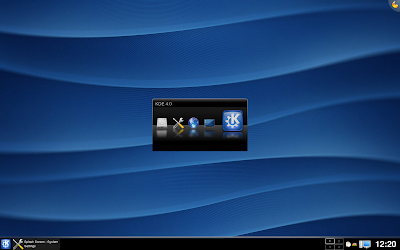
Starting up


I have been following the development of KDE4 for quite a few months now. The version I base this post on is from the main KDE development (trunk in svn) at the time of the release tagging freeze. As such it should be very similar to the packages you will receive from your favorite distribution on the 11th.


Progress all around


Many of the new frameworks are still almost unused in the user interface of the first KDE4 release. But some more obvious and easily implementable changes have already appeared in KDE4.0.0.

Graphics


Oxygen: Originally planned as the new icon set for KDE4, Oxygen has re-defined all aspects of KDE's user interface, including the window decorations and theme.


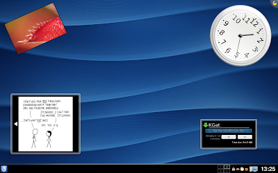
Plasma: Plasma is the new desktop shell of KDE4, one of the most anticipated components of KDE4 and the one which was started last.


Because of its late start plasma has not realized its full potential yet, but as with many things in KDE4.0.0 it will gain features rapidly in the future. Plasma's vision is a lot more than to display a panel and cool looking widgets. Stay tuned, already KDE4.1 will introduce new features.

KWin: KWin has been a very robust window manager for a long time. New in KDE4 is its ability to use desktop effects, window shadows and subtle animations. These features depend on the availability of OpenGL or at least XRender, which are not fully supported on all graphics cards yet although the situation is improving rapidly.


However to reduce the risk of an unusable interface, desktop effects may be disabled by default in KDE4.0.0. They can be easily enabled in Systemsettings (KDE4's control center replacement) under Desktop -> Desktop Effects.

Applications


Dolphin: The new default file manager in KDE4. While Konqueror has retained its ability to manage files (and cook coffee) dolphin is written specifically for this task.


The first visible piece of KDE4's new semantic search backend Nepomuk (the name won't be visible in the UI) is dolphin's ability to annotate and rate files.
In the future Nepomuk and Strigi will help you answer questions like "Who gave me this file?" or "What sources did I use on that KDE4.0.0 blog post?"
Progress in Qt4 (the toolkit KDE4 is based on) allows user interface polish like dolphin's sidebar, which changes its layout dynamically as the user drags it. No screenshot, you have to see this one in action.


Gwenview: KDE's image viewer Gwenview has received a lot of polish while it was ported to KDE4 and handles really, really well.


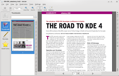
Okular: The new document viewer for KDE4, based on KDE3's KPDF application. It sports annotation features, previews, presentation mode, bookmarks and support for no less than 28 file types in my build.


Unreleased Applications


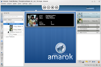
Amarok: The famous KDE based audio player has been ported to KDE4 and is receiving a major overhaul. It is currently in pre-alpha state, but I have been able to use it normally over the last few weeks. When it is ready, it may also be released for windows.


Dragon Player: Based on the Codein video player from the KDE3 days, Dragon Player continues a successful carrier as a simple and enjoybale video player.


These are some of the highlights of the upcoming KDE4.0.0. I hope you enjoyed this preview and have come to share my opinion that KDE4 is going to rock!

Take a look at this album for these and a few more screenshots I didn't include in this post. If you would like me to screenshot another application for you let me know in the comments and I will add it.